

burger king
test case
Analyzed the order funnel, discovered a new audience segment, and proposed improvements for upselling and fixing errors on the combo page.
role: product designer
timeline: april — may 2024
I wanted to eat a lot and decided to visit good old Burger King to order a combo for the first time, but I couldn’t figure out what was included and where to click.
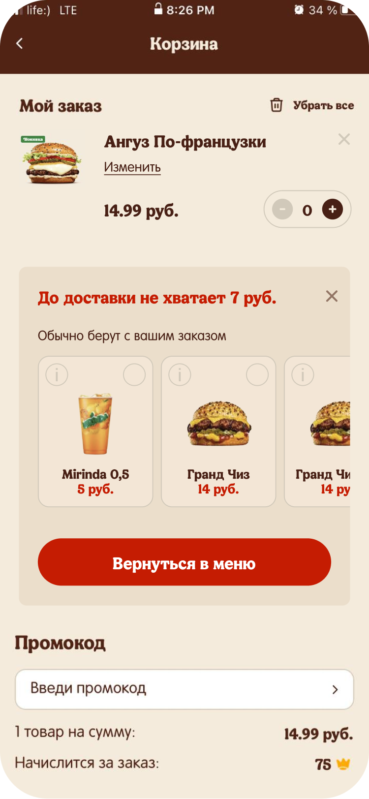
After scrolling to the bottom of the page, I finally found all the items in my combo and wondered why I couldn’t see what was included right away. After putting together my "basket," I realized I was short for delivery.Ï
I had to remember the fractional number, exit the basket, return to the catalog, and add more items. In Burger King, there’s no parallel switching like in Wildberries (WB); you have to exit the basket and re-enter it each time.
I expected this to take around 3 minutes, like in Dodo, but it dragged on for 13 minutes of constant effort. I got my combo, ate, but the question remained — am I the only one facing this problem?

talking to people
first interview with those who order at BK and eat combos
Everything I need is around me. I decided to ask my friends, classmates, and students. Delivery is a solution for their laziness or lack of time. It’s easy to find people, but finding those who use BK and order combos is hard. Out of 16 people I asked, only 3 fit both conditions. Hooray, we found our segment; it’s time to study it carefully.
second interview and discovering a new segment
After 3 interviews, I realized the answers were similar. Despite a lack of time, there’s a long search process, hesitation, and reflection. I decided to name this group "the undecideds." These people know their worth and take their time choosing. At any moment, they’re ready to go to a store if something doesn’t suit them and often base their choices on appearance. They don’t understand the need to add extra items for delivery when they’re just 3 rubles short, or the difference between paid and free combo options. They scroll the page up and down to make sure they don’t miss out on fries or a drink.
I take the order funnel and break down each step
I start from entering the app and end with completing the order and waiting. At each step, I write down approximate user behavior so that I can later gather information during interviews and adjust accordingly.
I end up with a funnel: choose what they want - if combo, assemble - add to cart - enter address, method and pay. Or just choose - assemble - checkout - pay.
I decided to find out through interviews with questions about...
- What do you like to order? How do you choose what to buy? (open question)
- How do you search (option)? (solution)
- Has there ever been a time when you couldn’t find (option)? (digging into the problem)
- What did you do to solve this problem? If the solution was well-thought-out: focus on the hypothesis of a long search (checking if it’s worth improving)
- Do you get something new each time? (open-ended question)
- Why do you choose the same thing? If something specific: do you keep combo settings the same, or do you change them? (if it’s always the same)
- How do you search for the same fast food? (this is about the solution)
- Do you have any issues with this solution? (problem)
- How are you trying to solve this issue now? (checking if it’s worth improving)
diving into the interviews
After the interviews, I learned about the jobs for which people use BK and created job stories from which I could form hypotheses and extract data from the interviews.
internally what I want
to the cart
the undecideds use
categories

If a person knows what they want — they’ll order through “My Past Orders.” If not, they’ll scroll. People don’t click on categories immediately; they use a combination of categories and scrolling.
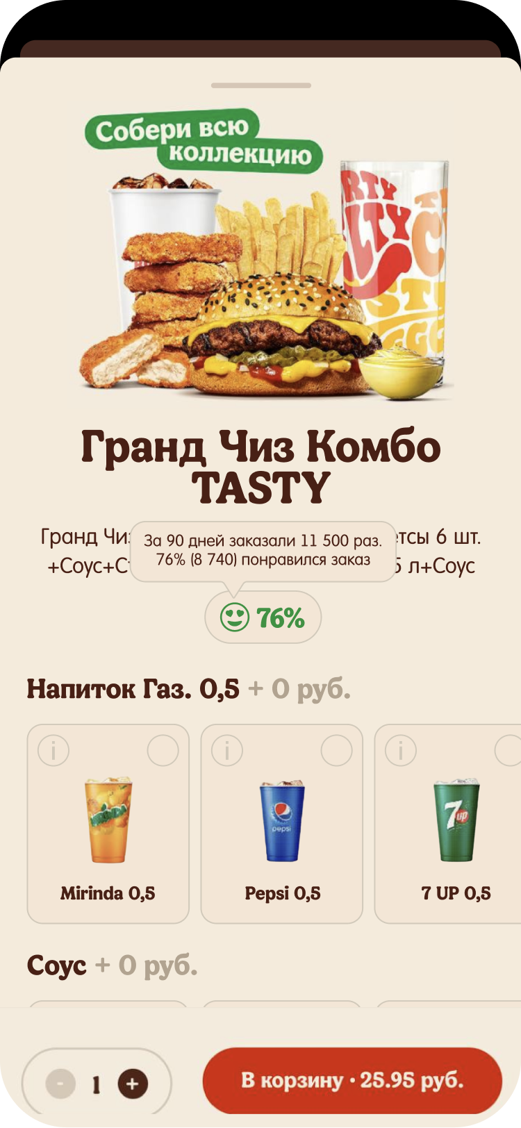
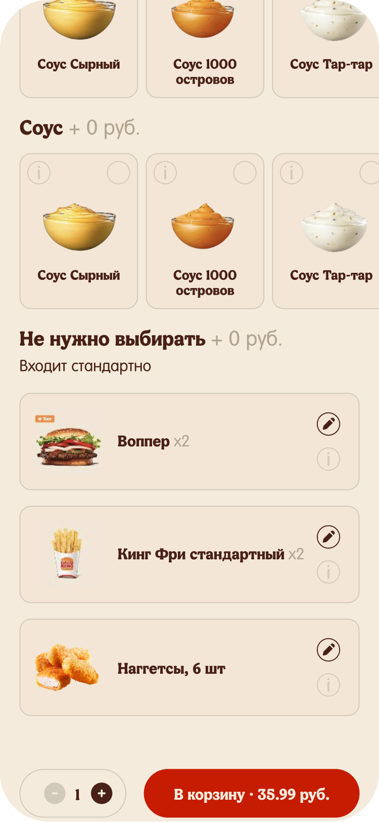
the description at the bottom, large card size, and no price on each item interfere with combo
assembly
People want the combo to be assembled as they need or want to choose as quickly as possible. They understand what’s in the combo based on the description. When choosing a combo, they check the page 2-3 times to make sure they didn’t miss anything. It’s important for people to choose initially, as they’re used to doing so with competitors, especially when it comes to customizing product combinations. The issue — the description at the bottom — was mentioned by 3 people.
the undecideds want to add extra items if they’re short
for delivery
People don’t want to leave their order to add more items if they’re short for delivery. They don’t like remembering the amount they need to add for free delivery.
screens
Initially, the combo description was located at the very bottom, making it unclear which options are paid. The cards were duplicated at first, with an empty card followed by a selection. After selecting, the cards were duplicated again.

The same problem persists here: the card is duplicated, taking up too much space. This space could be reduced by removing duplication and adding an edit option after the selection.

People decide whether to buy or not while looking at others. Introducing a feedback feature where users can like or dislike a product could allow the app to create a product rating to show how good the product is.

There was a problem that BK delivery only applies after the order reaches 21 rubles. If you’re short, BK pushes you to add more, but to order, you need to exit the cart and then go back in. Implementing an option to add one of the 5 most frequently purchased items would solve this issue.

When adding items through the extra order feature, the app pushes a positive message. If you don’t want to add anything, you can hide this option.

lacking data?
got any questions for me?
connect me on linkedin