

car loan
A website built on Tilda that helps create and grow a business using car-backed loans
role: product designer
timeline: june 2024
"child's play": client argumentation, approval, and results after launch
I was tasked with creating a website, including its layout. The final deliverable was a fully functioning site integrated with a CRM system. I chose to use the Tilda website builder, which allows for this with ease.
There were many restrictions from the client and a very specific set of requirements. I enjoy projects where I have to think critically and engage with stakeholders to justify my decisions and understand the business's perspective and concerns.
The project had a tight deadline — 1.5 weeks of full-time work, followed by revisions and the need to justify the decisions made.
client mindset
a sales-driven website that generates leads
The client approached the agency to increase their customer base, and for that, they needed a website. The site is meant to generate "leads" with several offers and corresponding contact forms, allowing users to leave their information and receive feedback on services. The unique selling propositions (USPs) and offers will be created by a marketing specialist, who will provide me with the text-based technical requirements.
modern and youth-oriented
The client wants to attract a younger audience and show that auto-collateral loans are fast and easy. The website should be straightforward, without any unconventional design approaches.
building trust
The loan and credit industry poses risks for users. There are many stories of people losing money, collateral, or worse when dealing with unverified companies. It's important for the client to demonstrate that the company is legitimate, has all necessary permits, and official documentation. The company is trusted, with positive reviews on Yandex, and it's crucial to show why this company is better than its competitors and why customers should choose to work with them.
costs
The main limitation was the amount of information. I received the technical requirements with the content that needed to be placed on the site. It took me about three days to fit this information into the design. A total of 10 days was spent working on the site, including layout and development in Tilda.
less talk, more action — straight to benchmarking
"friendly and intuitive"

"trustworthy"
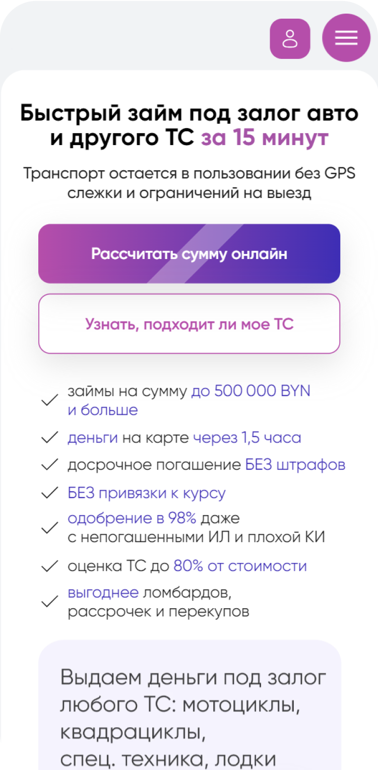
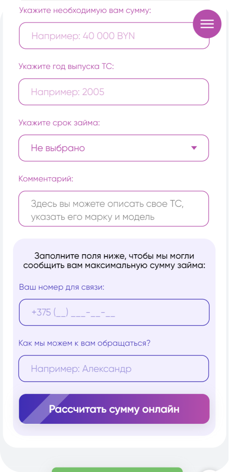
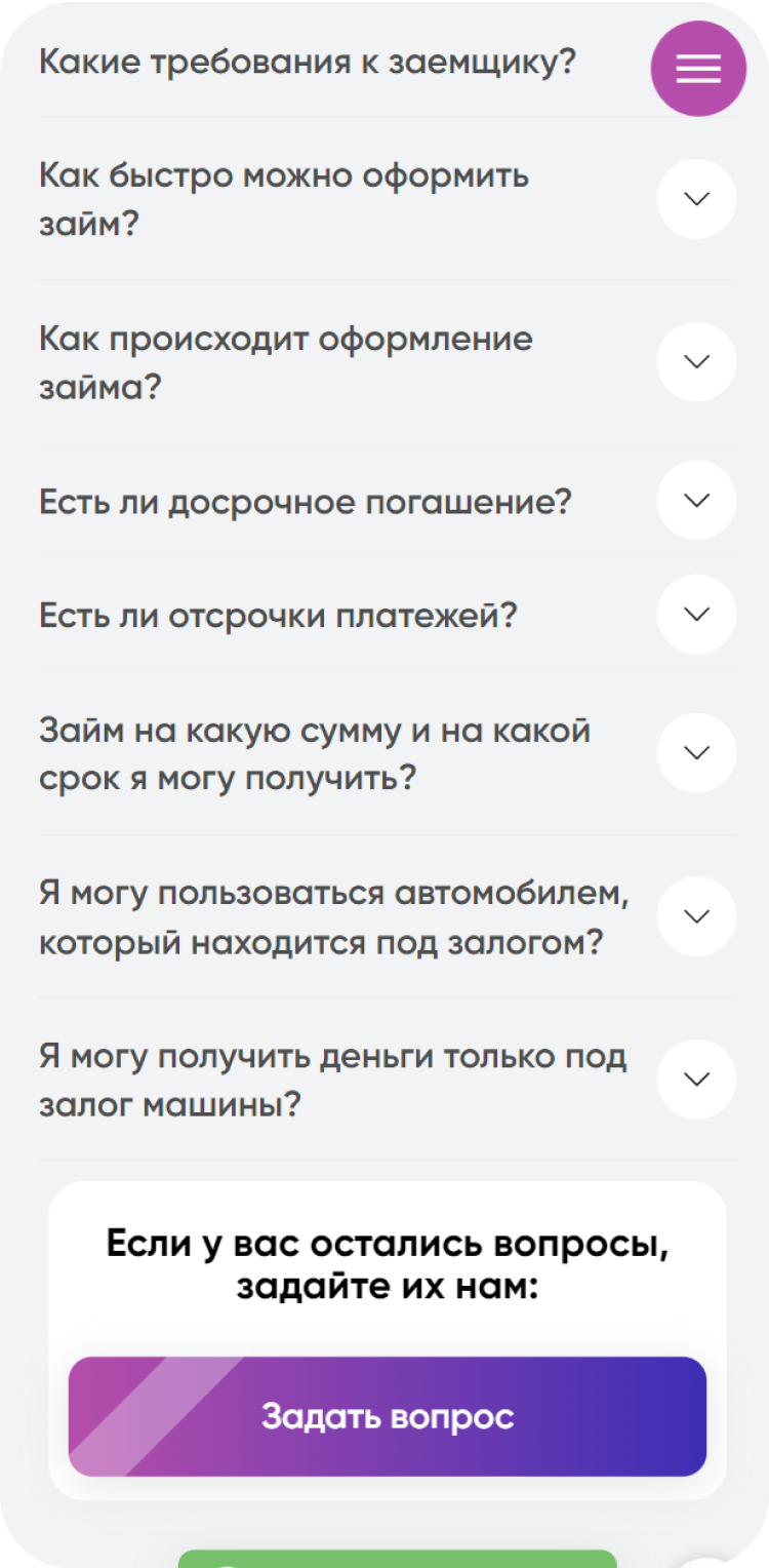
screens
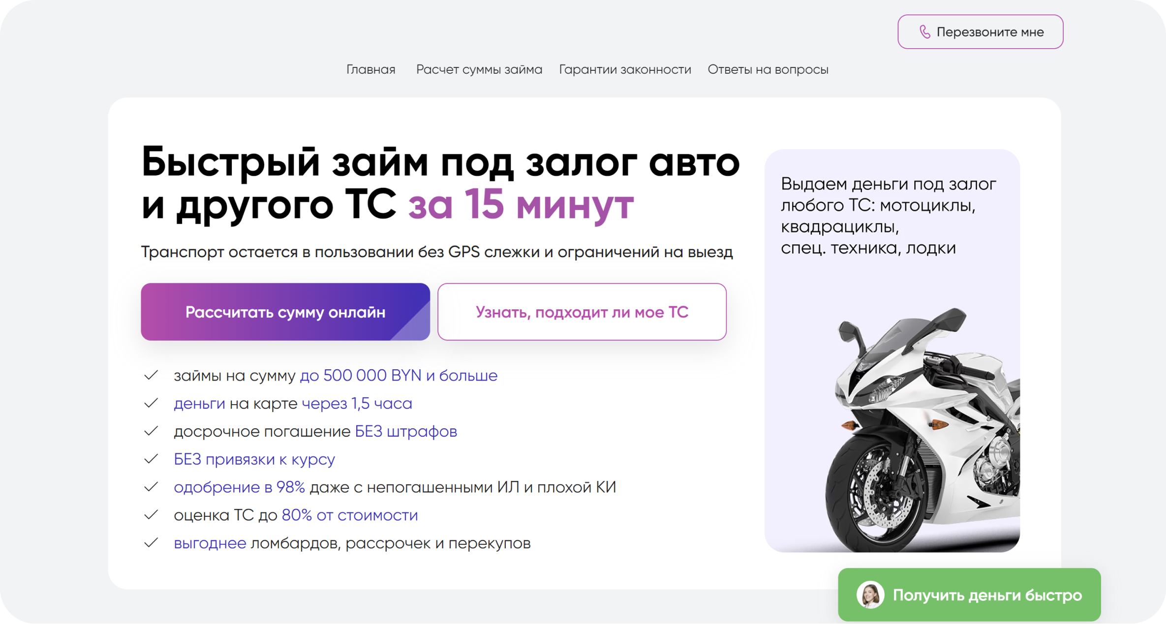
The homepage highlights key information about the time frame — "Get a loan in 15 minutes" — and features two buttons for different audiences: one for those who are confident, and another for those who are hesitant. On the right side of the banners, I decided to showcase all the vehicles the company works with, to reassure users. Additionally, there's a list of reasons why the company is the best choice. Three buttons are included to analyze the most effective call-to-action (CTA). The buttons have animations to draw attention.

There are many fields, but the most important one is the phone number, so I decided to highlight the input fields for personal information differently. The button is large, bright, and animated.
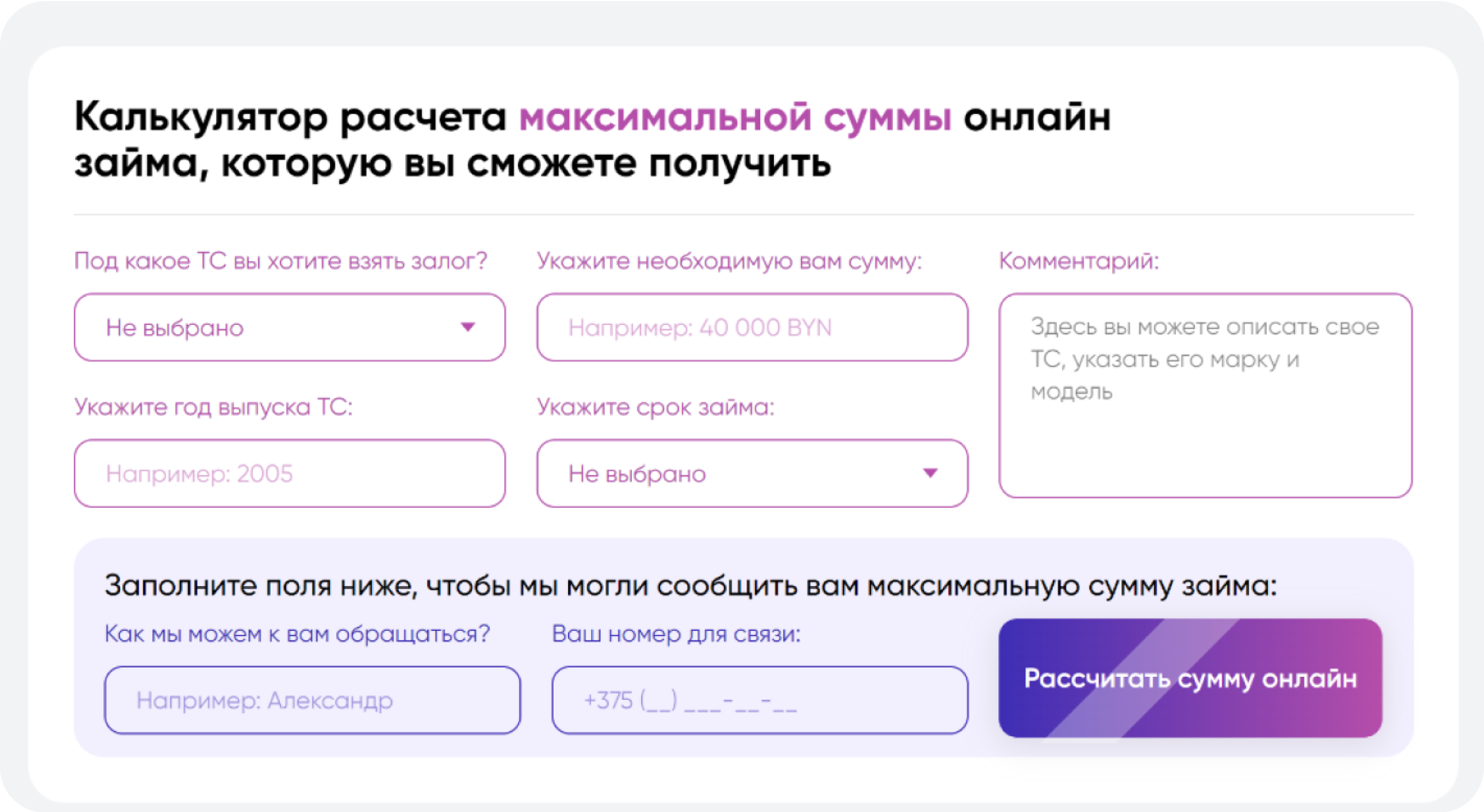
There are also modal windows that collect data.

mobile version
A mobile version of the site was also developed, as the task was to deliver a turnkey solution. In Tilda, this can be done fairly quickly, and it took a total of two days.
client feedback and results
After completing the project, I received feedback that it looked "childish." This was expected. I prepared a presentation explaining my design decisions and how I arrived at them. My question to the client was, what specifically felt "childish" to them? Their response focused on the text, color palette, and rounded corners.
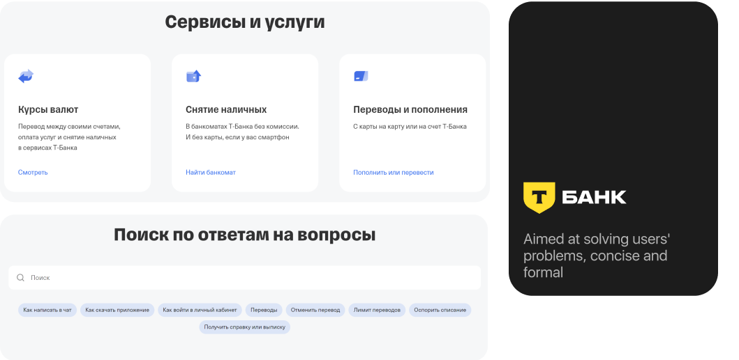
I included screenshots of the benchmarking results and supported my text with references to copywriting books. I strengthened this by showcasing examples of banking websites, explaining how the site should help users resolve their concerns and alleviate doubts. I put this into a presentation in 15 minutes and presented it to the client. Although skeptical, the client accepted the design and suggested a few adjustments.
As a result, the website had 560 visitors in the first month and generated 120 applications. One in four visitors submitted an application, resulting in a 21.4% conversion rate. The client gained leads and increased their revenue.
lacking data?
got any questions for me?
connect me on linkedin